In today's fast-paced world, simplicity and efficiency are key. That's why more and more businesses are opting for one-page checkout on their Shopify Plus stores. This seamless, user-friendly approach streamlines the purchasing process, resulting in higher conversion rates and happier customers. If you're ready to optimize your checkout experience, this ultimate guide will walk you through everything you need to know.
Understanding One-Page Checkout
Before we dive into the setup and optimization of one-page checkout, it's important to grasp the concept behind it. The traditional multi-page checkout process often frustrates customers, leading to cart abandonment. One-page checkout condenses all the necessary steps into a single page, eliminating unnecessary clicks and reducing friction. By making it easier for customers to complete their purchases, one-page checkout can significantly boost your sales.
The Concept of One-Page Checkout
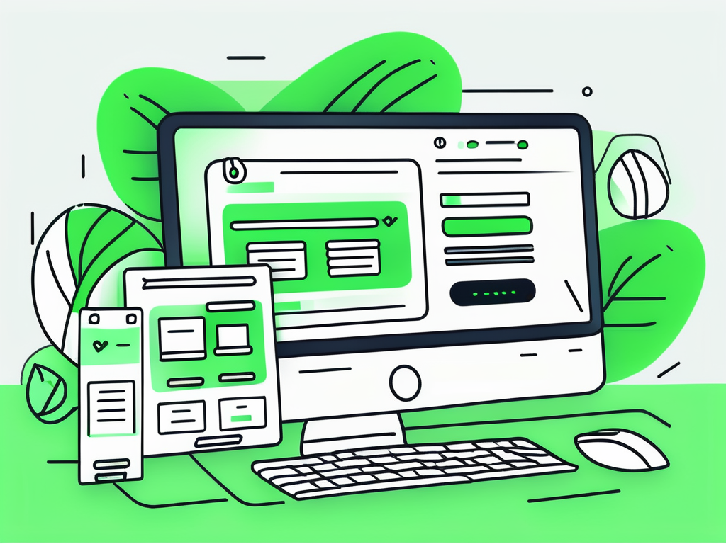
One-page checkout is exactly what it sounds like – a checkout process that takes place on a single page. Instead of navigating through multiple pages to enter shipping and payment information, customers can complete their purchase in one smooth flow. This simplifies the entire transaction, making it more user-friendly and efficient.
Imagine this scenario: a customer has found the perfect product on your Shopify Plus store. They are excited to make a purchase, but as soon as they click on the "Checkout" button, they are greeted with a multi-page checkout process. They have to enter their shipping address, then click "Next" to enter their payment information, and then click "Next" again to review their order before finally clicking "Place Order". This cumbersome process can be frustrating and time-consuming for customers, often leading to cart abandonment.
However, with one-page checkout, the entire process is simplified. Customers can enter their shipping address, payment information, and review their order all on a single page. There are no unnecessary clicks or page reloads, creating a seamless and efficient checkout experience.
Benefits of One-Page Checkout
There are several benefits to implementing one-page checkout on your Shopify Plus store. Firstly, it reduces the steps required to complete a purchase, reducing the chances of cart abandonment. With a traditional multi-page checkout, customers may get discouraged or distracted during the process, leading them to abandon their carts. By condensing everything into one page, you eliminate unnecessary steps and make it easier for customers to follow through with their purchase.
Furthermore, one-page checkout eliminates distractions that may lead customers away from the checkout process. In a multi-page checkout, customers may be tempted to explore other areas of your website or get sidetracked by external links. By providing a focused and streamlined checkout experience, you keep customers on track and increase the likelihood of conversion.
Another advantage of one-page checkout is the improved user experience. Customers appreciate simplicity and efficiency when it comes to online shopping. By offering a seamless and user-friendly checkout process, you enhance customer satisfaction and build trust in your brand. Happy customers are more likely to return for future purchases and recommend your store to others.
In summary, one-page checkout is a game-changer for e-commerce businesses. It simplifies the checkout process, reduces cart abandonment, eliminates distractions, and enhances the overall user experience. By implementing one-page checkout on your Shopify Plus store, you can optimize your sales funnel and maximize conversion rates. So why wait? Start exploring the possibilities of one-page checkout today!
Setting Up One-Page Checkout on Shopify Plus
Now that you understand the concept and benefits of one-page checkout, it's time to set it up on your Shopify Plus store. Follow this step-by-step guide to get started:
Step-by-Step Guide to Setup
1. Access your Shopify Plus admin panel and navigate to the checkout settings.
2. Locate the option for checkout customization and enable the one-page checkout feature.
3. Customize the layout and design of your one-page checkout page to align with your brand identity.
4. Test your one-page checkout to ensure all the necessary fields and payment options are functioning correctly.
Customizing Your Checkout Page
While the default one-page checkout layout can work well for many businesses, it's important to customize it to align with your brand and optimize the user experience. Consider the following customization options:
- Branding: Add your logo and color scheme to maintain consistency throughout your store.
- Clear Call-to-Action: Ensure that your "Buy Now" or "Checkout" button is prominently displayed and easily recognizable.
- Minimal Form Fields: Keep the number of required fields to a minimum to reduce friction and speed up the checkout process.
- Progress Indicators: Show customers how far they are in the checkout process to create a sense of progress and reduce anxiety.
Branding is a crucial aspect of creating a strong and memorable brand identity. By adding your logo and color scheme to your one-page checkout page, you can ensure that customers feel a sense of familiarity and trust as they complete their purchase. This consistency will help reinforce your brand image and make your store more memorable.
The call-to-action button is the final step in the checkout process, and it's essential to make it clear and easily visible. By using contrasting colors and placing it in a prominent position on the page, you can guide customers towards completing their purchase. A clear and recognizable call-to-action button will help reduce cart abandonment and increase conversion rates.
One of the main advantages of one-page checkout is its simplicity and efficiency. By keeping the number of required form fields to a minimum, you can streamline the checkout process and reduce friction for your customers. Only ask for essential information that is necessary for completing the purchase, such as shipping address and payment details. This will help improve the overall user experience and increase customer satisfaction.
Checkout processes can sometimes feel lengthy and overwhelming for customers, leading to cart abandonment. To alleviate this, consider adding progress indicators to your one-page checkout page. Progress indicators visually show customers how far they are in the checkout process, creating a sense of progress and reducing anxiety. This simple addition can help improve the user experience and increase the likelihood of customers completing their purchase.
By customizing your one-page checkout page with these options in mind, you can create a seamless and user-friendly checkout experience for your customers. Remember to regularly test and optimize your checkout process to ensure it continues to meet the needs and expectations of your target audience.
Optimizing Your One-Page Checkout
Simply setting up one-page checkout is not enough. To fully maximize its potential, you need to optimize the design and flow of your checkout process. Here are some best practices to keep in mind:
Best Practices for Checkout Design
1. Mobile Responsiveness: Ensure that your one-page checkout is fully optimized for mobile devices, as more and more customers are shopping on smartphones and tablets.
2. Minimal Distractions: Remove any unnecessary elements or links on your one-page checkout page to keep customers focused solely on completing their purchase.
3. Guest Checkout Option: Provide the option for customers to checkout as a guest to reduce friction and encourage conversions.
Streamlining the Checkout Process
1. Autofill: Utilize autofill features to make it easier for returning customers to complete their checkout process quickly.
2. Multiple Payment Methods: Offer a range of payment options to accommodate different customer preferences, such as credit cards, PayPal, and Apple Pay.
3. Address Validation: Implement address validation tools to ensure accurate shipping information and minimize delivery errors.
Troubleshooting Common Issues
While one-page checkout is designed to simplify the purchasing process, issues may still arise. It's important to be prepared to address customer concerns and handle any technical glitches. Here are some common issues and how to troubleshoot them:
Addressing Customer Checkout Concerns
1. Lack of Trust: Display trust symbols, such as secure payment badges or customer testimonials, to build trust and encourage customers to complete their purchase.
2. Cluttered Design: Simplify your checkout page's design by removing unnecessary elements and providing clear instructions to guide customers through the process.
Solving Technical Glitches
1. Payment Errors: Ensure that your payment gateway is properly integrated and regularly check for any errors that may prevent customers from completing their transactions.
2. Page Loading Delays: Optimize your one-page checkout by compressing images and minimizing scripts to improve page load times.
Measuring the Success of Your One-Page Checkout
Implementing and optimizing one-page checkout is not a one-time task; it requires ongoing evaluation and measurement to ensure its effectiveness. Here are some key performance indicators to monitor:
Key Performance Indicators to Monitor
1. Conversion Rate: Track the percentage of visitors who complete their purchase compared to the total number of visitors to measure the effectiveness of your one-page checkout.
2. Abandonment Rate: Monitor the number of customers who start the checkout process but fail to complete the purchase. Identify any potential barriers and make adjustments accordingly.
Interpreting Checkout Analytics
Utilize analytics tools to gain insights into your one-page checkout performance. Look for patterns or trends in customer behavior, such as drop-off points or high-performing product categories. Use this data to make informed decisions and continually optimize your one-page checkout experience.
By implementing one-page checkout on your Shopify Plus store, you can simplify the purchasing process and boost conversions. Remember to continually optimize your checkout experience and measure its success to ensure you're providing the best possible user experience. So why wait? Start optimizing your one-page checkout today and unlock the potential for increased sales and customer satisfaction.
Ready to take your Shopify Plus store to the next level after mastering one-page checkout? Let Owlfred, your wise companion from OwlMix, guide you to the perfect Shopify apps that can further enhance your online business. With OwlMix's extensive directory, finding your next innovative app is just a click away. Whether you're looking to amplify your marketing efforts, streamline inventory management, or boost customer engagement, our curated selection is tailored to meet your specific needs. Find your next Shopify app today and watch your e-commerce success take flight!


