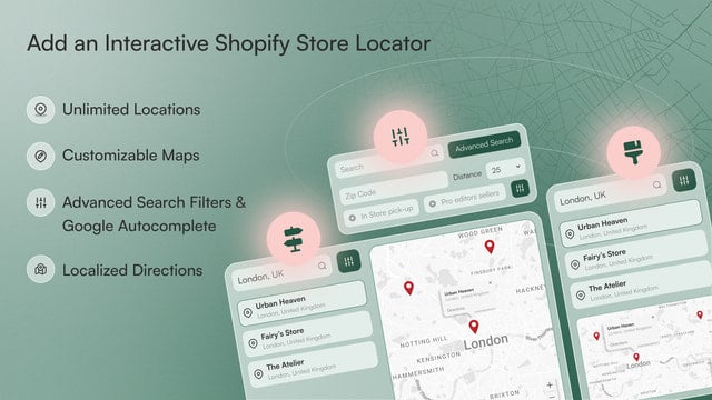
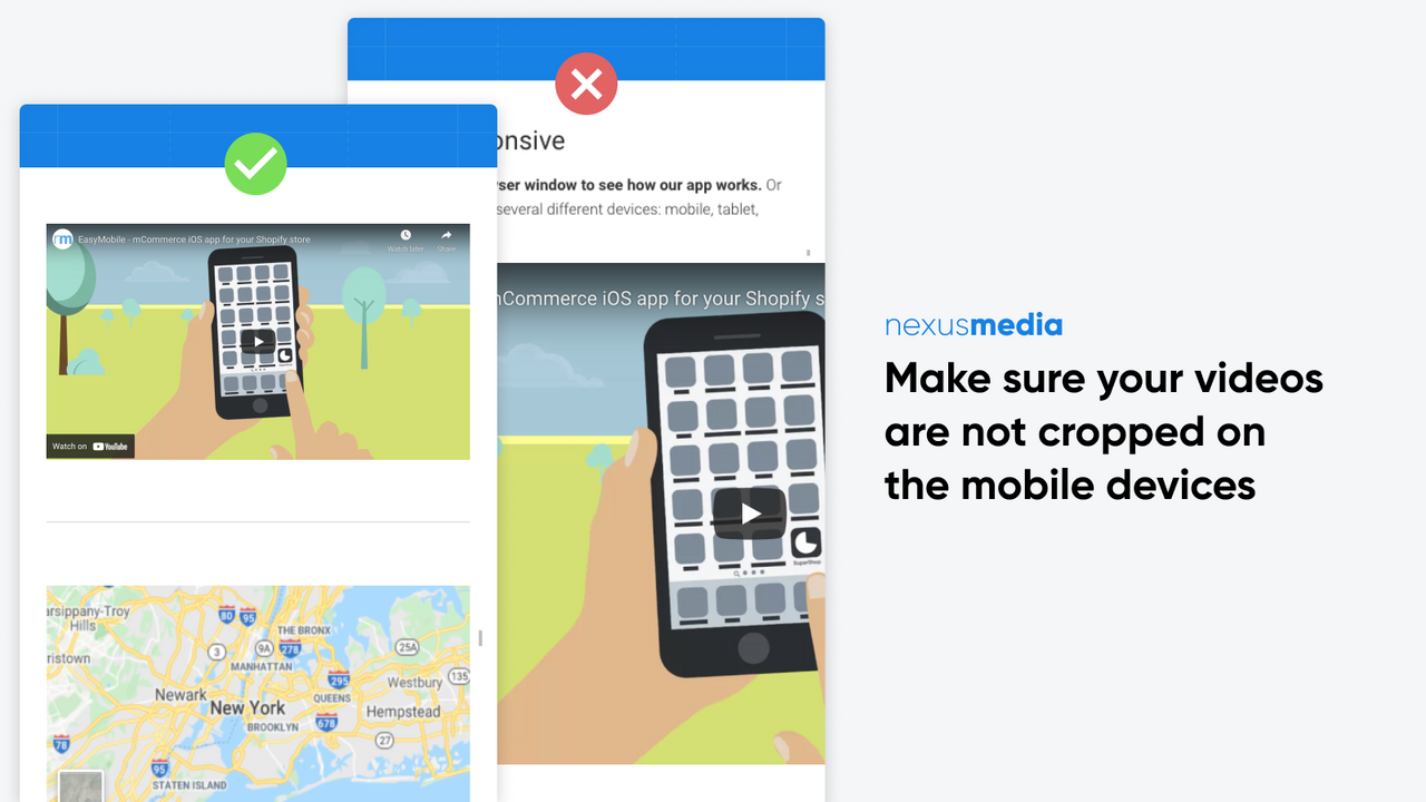
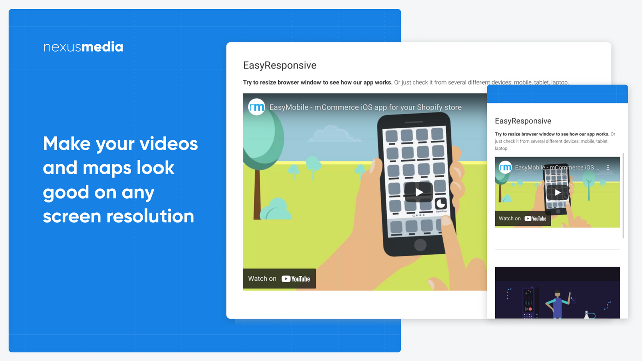
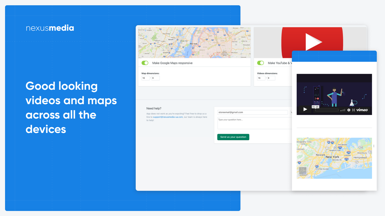
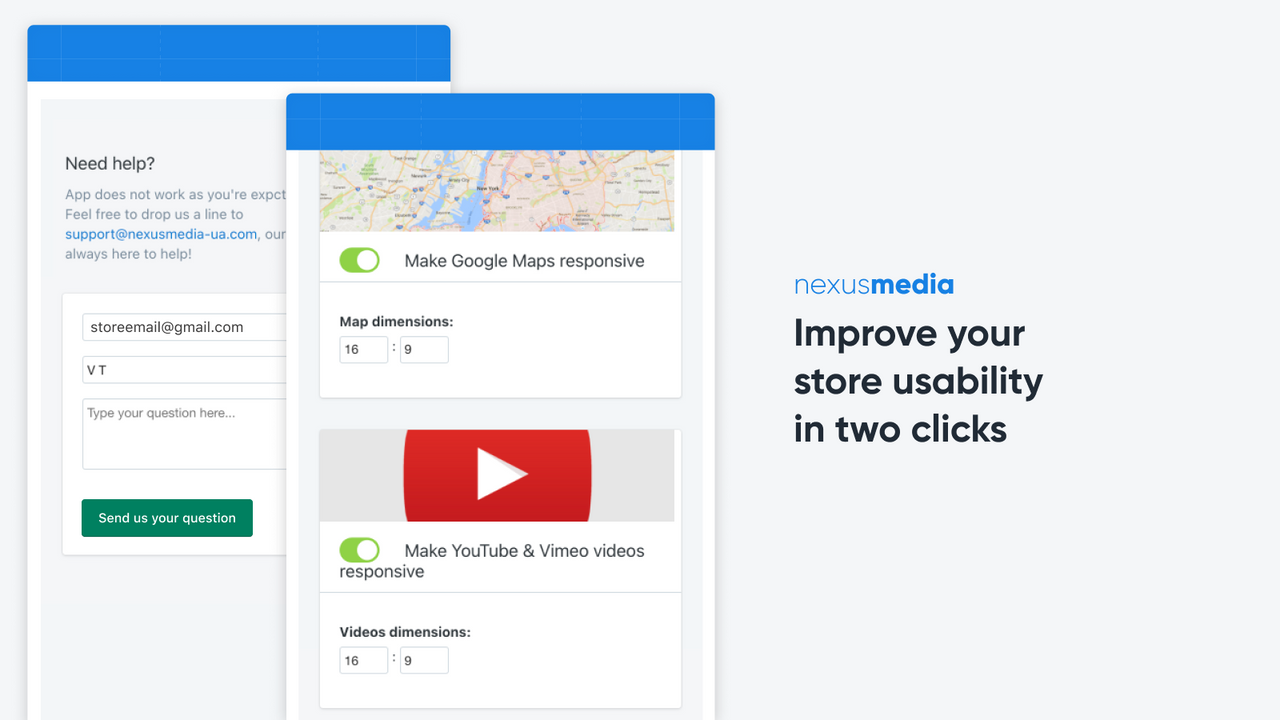
Last Updated:
September 5, 2024

Make your videos and maps responsive on all devices.

Find it on the Shopify App StoreFind it on the Shopify App Store
Get Started

Address responsive embedding challenges with this practical solution for Shopify e-merchants. This invaluable app tackles the frequent issue of integrating non-responsive YouTube and Vimeo videos, as well as Google Maps, into various website pages. Its wide-reaching compatibility means it can work seamlessly across all areas of your site, including Articles, Products, and any other page.

Navigating complex coding processes is replaced with a streamlined, user-friendly solution, where maintaining aspect ratios and embedding responsive content becomes an uncomplicated process. The smart design allows 16:9 aspect ratio for videos and maps as default, but this can easily be modified in the adjustable settings.

This is a go-to tool for those wanting a trouble-free embedding experience, eliminating the need to engage external developers or spend valuable time on complicated coding. Leverage this app to empower your site, effectively showcase multimedia content and significantly enhance your users' browsing experience.

Features

Make your YouTube and Vimeo videos, and Google Maps responsive
Configure flexible video aspect ratios and dimensions for embedded videos
Ensure improved store usability with no cut off videos or maps on mobile devices
Seamlessly integrate YouTube, Vimeo, and Google Maps
Enhance user engagement by showcasing multimedia content effectively

Benefits

Increase user engagement and time on site with seamlessly integrated responsive videos and maps
Save time and money by eliminating the need for complex coding processes or external developers
Enhance the browsing experience and showcase multimedia content effectively

About the Vendor

NexusMedia
Dziatwy 18B/32, Warsaw, 03-109, PL
Visit Vendor Website
Dziatwy 18B/32, Warsaw, 03-109, PL Map

Works with

Pricing

$2/month. Free trial available.
We have detected the following pricing bands for this app are as follows:
Minimum Price:
$
2.00
MaximumΒ Price:
$
2.00
All charges are billed in USD. Recurring and usage-based charges are billed every 30 days. Pricing may differ to that listed above, please check the link below for accurate and up to date pricing details.
See all pricing options

Deal available!

View Deal

Review Trend Insights

0 review in the last 30 days.

0 reviews in the last 30 days.

0 review in the last 90 days.

0 reviews in the last 90 days.

Install Trend Insights

1 install in the last 30 days.

1 installs in the last 30 days.

1 install in the last 30 days.

1 installs in the last 30 days.

Owlfred Review

"Easy Responsive Videos & Maps" by NexusMedia OÜ is a nifty little backend app that certainly lives up to its name. This app is a godsend for the merchants who are grappling with the challenges of having non-responsive YouTube, Vimeo videos and Google Maps on their stores. With this app, you can easily ensure your videos and maps look good across all devices, increasing overall store usability. It's impressive that the app offers a flexible video aspect ratio and allows you to easily adjust dimensions in the settings. As an image editor, it works silently behind the scenes to improve the user experience, tackling common problems like cut off videos or maps on mobile devices. Despite having no tracked installs yet, it holds an amazing average rating of 5 based on 4 reviews. For a mere $2 per month (following a 7-day free trial), it's a price you'd be hard-pressed to beat for a better-optimized, user-friendly store experience. As a wise owl, I recommend giving it a whirl!

Owlfred Mixtape

See More Shopify App Songs

Promote This Shopify App

Copy and paste the provided badge code into your site's HTML. The featured badge links back to this page and the badge itself is an SVG so should scale to wherever you decide to place it!


Frequently Asked Questions

What is a responsive video player?
A responsive video player adjusts its size based on the screen or device it is being viewed on. This ensures optimal video viewing experience for users regardless of device size or resolution.
Are YouTube videos responsive?
Yes by default, YouTube videos are responsive in nature. When you share a YouTube video, it automatically adapts to the size of the device it is being viewed on. However, certain settings and landings may alter this default feature, therefore it is important to check for your specific application.
How to make embedded video responsive CSS?
To make an embedded video responsive, you will need to apply some CSS styles. Wrap the video in a container and give it a class. In your style sheet, set the class's position to relative and padding-bottom to a ratio for your video. Then set the iframe to absolute and specify its size as 100% width and height.
What does the Easy Responsive Videos & Maps app do?
The Easy Responsive Videos & Maps app allows Shopify merchants to seamlessly integrate responsive videos and maps into their store. This app ensures videos and maps not only look great, but also scale appropriately across various screen sizes and devices, leading to a better user experience.

Shopify App Comparison: Easy Responsive Videos & Maps vs Super Zoom Image Magnifier - which is better?

We have compared the Easy Responsive Videos & Maps app with the Super Zoom Image Magnifier app, and both of them offer unique capabilities and benefits to enhance the user experience on your website. The Easy Responsive Videos & Maps app allows you to seamlessly integrate non-responsive YouTube and Vimeo videos, as well as Google Maps, into various pages of your site. This app provides a practical solution for e-merchants, eliminating the need for complex coding processes or external developers. With this app, you can increase user engagement and save time and money by showcasing multimedia content effectively without any cut-off videos or maps on mobile devices.

On the other hand, the Super Zoom Image Magnifier app takes online shopping to a new level by allowing customers to scrutinize product images with high-resolution magnification. This feature-rich app can be easily activated and deactivated with a single click, without any theme editing required. By enabling customers to see intricate details on both mobile and desktop devices, this app enhances the shopping experience, boosts sales, and reduces product returns. With customizable options for the magnifying lens' border, color, and size, you can tailor the app to suit your store's branding and design.

Both apps offer valuable capabilities and benefits for your website, so it ultimately depends on your specific needs and preferences. For those looking to showcase multimedia content and enhance the browsing experience, the Easy Responsive Videos & Maps app is a great choice. If you want to empower your customers to see the finest details of your products and reduce returns, the Super Zoom Image Magnifier app is the way to go. We recommend considering both apps and selecting the one that aligns best with your website goals.

Attribute
Easy Responsive Videos & Maps Shopify AppEasy Responsive Videos & Maps
Super Zoom Image Magnifier Shopify AppSuper Zoom Image Magnifier
Average Rating 5 out of 5 3 out of 5
Number of Reviews 4 1
Estimated Installs 10 5
Min Price $2.00 $2.00
Max Price $2.00 $2.00
Works With
Install App

Share your thoughts

You might also like...

Recommended Shopify Apps